Our colors say a lot about who we are. Our palette helps audiences identify us at a glance, and the way we use color sets the tone for our communications.
Our color palette has two levels: primary and secondary. Communications should lean
heavily on our primary palette, but the secondary palette, tints, and shades may be
used to keep layouts from becoming too stale or one-dimensional.
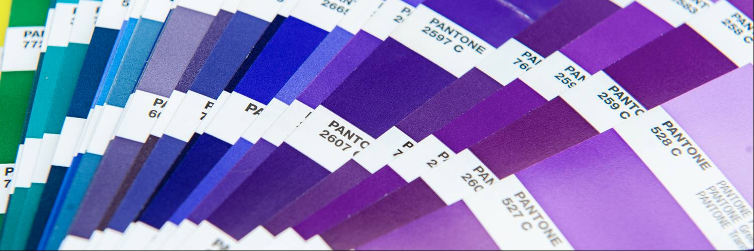
When using color builds, always use the color values listed here. They have been adjusted for the best reproduction on screen and in print, and may not match Pantone Color Bridge breakdowns.
To maintain visual consistency across all University materials, only use the colors outlined in this section.
Primary ColorsOur primary colors represent Florida Poly at the highest level, and should be present in all communications. |
|
|
Poly Purple |
Cyber Blue |
Secondary ColorsOur secondary palette complements the primary colors and creates flexibility so communications can shift for various needs. Secondary colors should never be used on their own or appear more prominent than the primary palette. |
|||
|
Pixel Purple |
Python Plum |
Tech Slate |
Graphite Gray |
Best PracticesWe want our communications to be experienced by all audiences, so thoughtful consideration should be taken when choosing colors for digital communications. Here are a few hints for selecting color combinations that are visually effective, but functionally useful for ADA compliance. |
||
|
Provide high contrast. |
Be color blind friendly. Try to avoid placing red and green together, especially in navigation, map graphics, and other wayfinding elements. |
Don’t rely on color alone. Since some users override page colors, color should not be the only way information is conveyed. Make sure information is available even if colors are altered. This can mean adding another cue, such as an underline to show a link, or an icon to reinforce the meaning. |


