Our logo represents us at the very highest level and is vital to our brand. It acts
as a signature, an identifier, and a stamp of quality. To maintain consistency throughout
our communications, follow the few simple guidelines in this section.
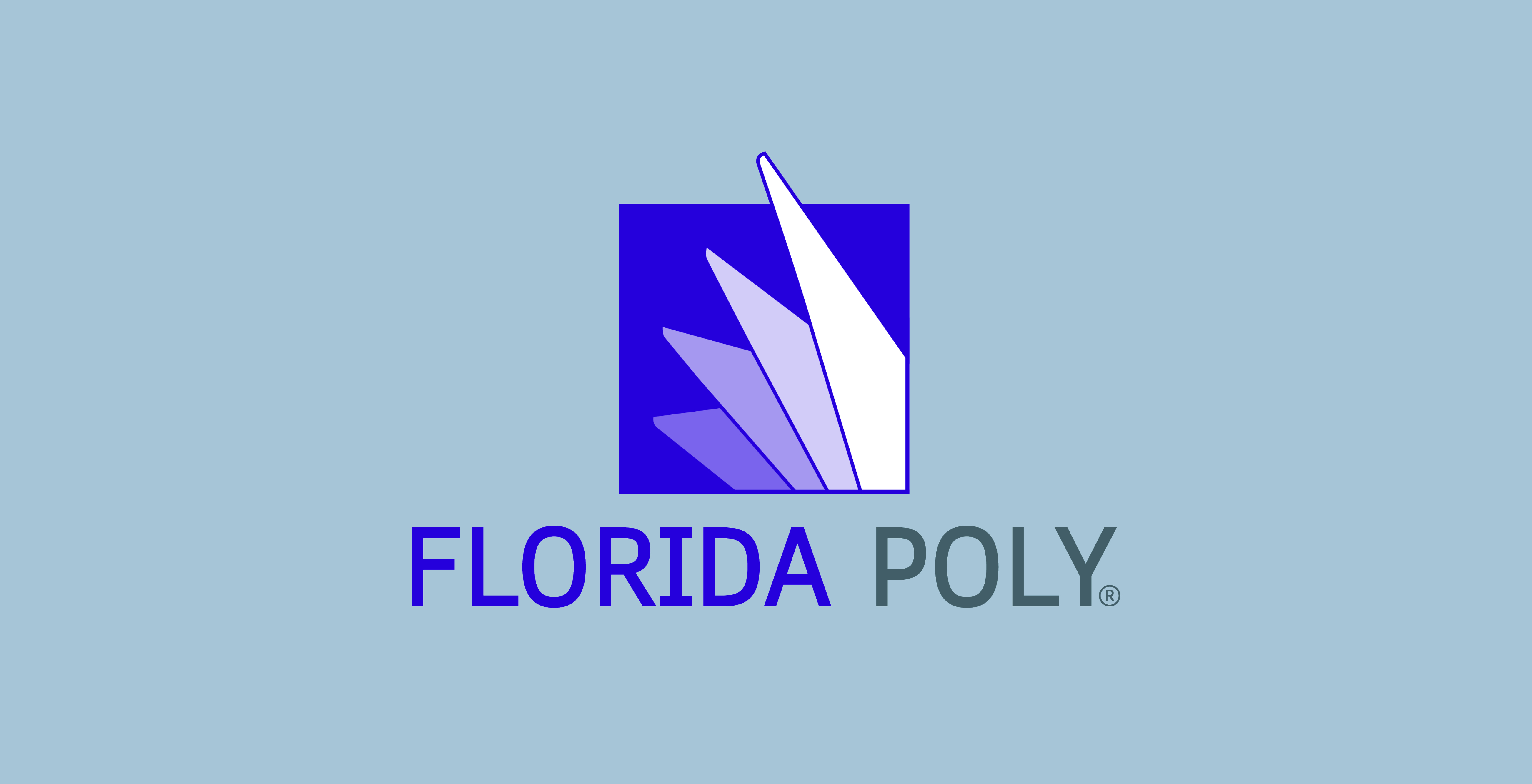
University Logo
Our logo is the most important and recognizable element of our brand’s identity. It
is a graphic symbol that represents our organization to the outside world and acts
as an identifying and unifying mark. The logo is comprised of two main elements: the
louvers and the University logotype.
As we continue to build our school’s academic reputation, we must build our brand
equity as well. Using our name and mark together, consistently, is critical to this
effort.
Only use authorized Florida Poly logo files. Never redraw, typeset, or alter them
in any way. Contact marketing@floridapoly.edu with questions.
Carousel placeholder image
Primary Logo
This is the main version of the University logo. This horizontal version should be used almost exclusively; the versions below are
reserved for special instances with size constraints.
Carousel placeholder image
Secondary Logo
This alternative logo can be used when space is limited or when it fits the imprint
area better.
Carousel placeholder image
Mark Only Logo
This mark-only version should be used in rare instances when space is limited.
Placement
To maintain a flexible consistency in appearance, the primary logo should either be
left aligned at the top of the page as an intro or right aligned at the bottom of
the page as a sign-off.
Placement of the logo on promotional pieces is more flexible based on the relationship
to artwork and photos.
Color Variations
ADD SECOND IMAGE HERE
Preferred Full-Color Logo (primary and stacked versions)
The Pantone, CMYK, or RGB full-color logos are preferred. Use Pantone or CMYK for
any print use such as collateral or business materials. Use RGB for electronic use
such as PowerPoint presentations, digital, or video.
One-Color Logos
Use the solid color scheme when full-color printing is not an option and for applications
such as embossing, debossing, die-cutting, or extrusion.
Reverse (Knockout) Logos
Use the reverse logos for applications on color and photographic backgrounds. Use
the two-color reverse logo on solid purple backgrounds only. Always ensure that the
background you choose provides sufficient contrast for the logo.
SHADING?
Minimum Sizes
To ensure visibility and legibility, logos should never be presented in sizes smaller
than the requirements shown on this page.
To maintain visual integrity, applications using alternative reproduction techniques
such as embroidery and silkscreen may require presenting the logos at larger sizes
than indicated here.
These are only minimum sizes. Logos should be sized appropriately for the piece being
designed.
No smaller than 1.5 inches wide.
No smaller then 0.75 inches wide.
No smaller than 0.75 inches wide.
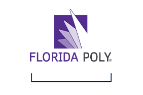
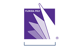
Clear Space
Whenever you use the logo, it should be surrounded with clear space to ensure its
visibility and impact. No graphic elements of any kind should appear inside this zone.
This rule appies to all versions of the logo.
Clear space is determined by twice the height of the "F" in Florida.
Visual example of the required clear space around the logo.
Visual example of the required clear space around the logo.
Incorrect Use
Correct and consistent use of the primary logo is an essential part of building and
maintaining brand equity. While a great deal of flexibility has been built into the
visual identity system, the correct use of each element has been carefully defined.
The examples shown here represent some–but not all–of the ways the Florida Poly logo
might be used incorrectly. If you have questions about the correct or incorrect use
of the logo, contact marketing@floridapoly.edu.
DON’T skew, stretch, or bend the logo in any way.
DON’T rotate the logo.
DON’T use drop shadows or other visual effects.
DON’T use any colors other than those specified in this document.