Correct and consistent use of the mark is an essential part of building and maintaining brand equity. While a great deal of flexibility has been built into the visual identity system, the correct use of each element has been carefully defined.


Our Phoenix mark may appear only in the color variations below.


Don't get too close or you'll get burned!
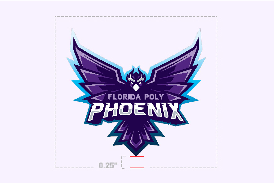
A 0.25" (1/4") margin of clear space is required around all versions of the Phoenix artwork.
Maintaining ample clear space around the logo ensures that it remains legible, and doesn’t get lost within the composition.
Photos, text, and graphic elements should never be placed within the pictured clear space.

All versions of the Phoenix artwork can be used in a variety of ways on digital and printed materials.
To inquire about ordering items that use the mark, submit the logo request form.
Do use the Phoenix marks:
Do not alter any of the approved marks in any way.
Also, please do not use any variation of the Phoenix marks: